Inspiration Gallery
Blog
Tile Calculator
08065423741



.svg)


How to Choose Tiles When Your Room Has Almost No Natural Light
ByNandana Priya

Mon , Nov 09 , 2026

Read Time: 5 Min


 Copied!

A room with one small window, or none at all, gives the space very little daylight. If that sounds like your bathroom, passage or inner bedroom, choosing tiles for dark rooms can start to feel like guesswork. White seems the obvious answer, yet it is only one part of the picture. While lighter tiles can help reflect the light already reaching the room, they cannot brighten a space on their own.
Picking tiles for low-light rooms like these means thinking about where the light sits and how it travels across the surface. Tile finish, pattern, texture and grout all respond to it. A glossy wall near a bulb may show reflections clearly, and even soft cream tiles for the room may shift in tone under a warm ceiling light. Light coloured tiles are just one route among several, so read on to see the others and how to judge each one inside your own room.
Check the Natural and Artificial Lighting
Before choosing tiles for a room with low natural light, look at where the available light actually reaches. Two rooms can both feel dark but have very different lighting conditions. One may receive a little daylight through a small window, while another may depend on artificial lighting for most of the day.
Notice which walls and parts of the floor receive some daylight and which remain in shadow. Then consider the lights you normally use in the room. A single ceiling light, wall lights, spotlights, and other light sources can illuminate the tiled surface differently depending on where they are placed.
This gives you a more useful starting point for comparing tiles for rooms. Rather than expecting a particular tile to make a dark room brighter, you can judge how its colour, surface, and details are likely to appear under the light the room actually has.
Light-Coloured Tiles Are an Option, Not a Rule
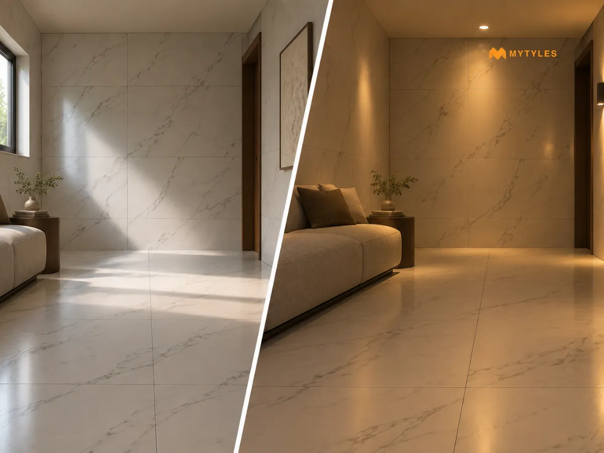
Once you understand the room's lighting, colour is usually the next thing to compare. Light shades such as white, ivory, cream, beige, pale grey, and muted colours are often considered for tiles for dark rooms. However, choosing the palest option available does not tell you how that colour will actually appear in the space. These colours generally reflect more light than darker shades, although the amount of light reflected depends on the individual surface.
Pay attention to the undertone as well. Two tiles that look similarly light at first can have noticeably different warm, cool, or neutral undertones. Under warm artificial lighting, for example, cream or beige tiles for low-light rooms may appear warmer than they did elsewhere. Grey and off-white tiles for interiors can also shift in appearance depending on the light source.
Instead of relying only on names such as 'white', 'cream', or 'light grey' tiles, compare the actual tile under the lighting used in the room. This gives you a better sense of whether the colour works with the space before moving on to the finish.
How Different Tile Finishes Interact With Light
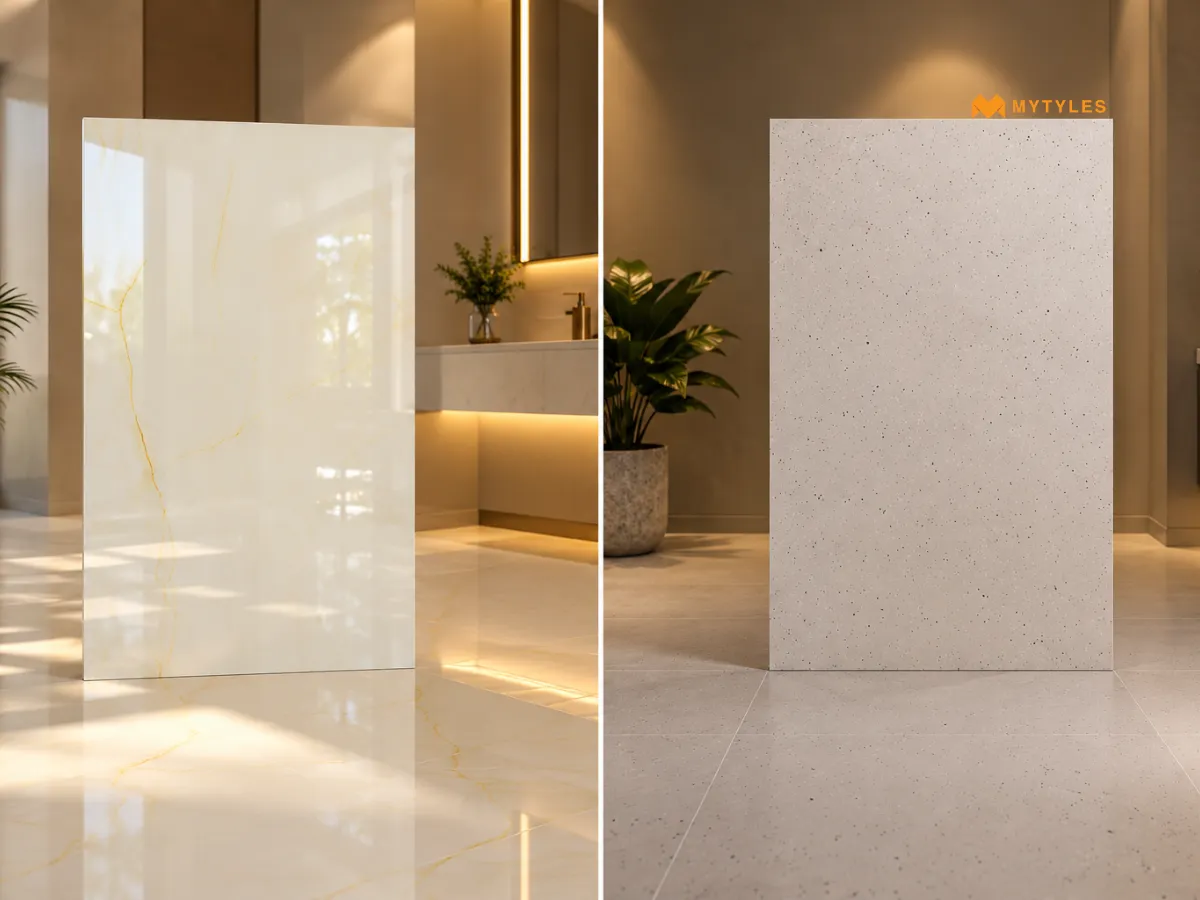
Tile finishes affect how noticeable reflections are across the surface. This is why it helps to look at the finish together with the position and direction of the room's lights.
Glossy Surfaces and Other Reflective Finishes
Glossy and other light-reflective tiles can make the reflections more visible across the tiled surface. However, this does not mean glossy wall tiles or floor tiles will produce the same effect everywhere. Their appearance can change depending on the angle from which the tile is viewed and where the light source sits.
Matt Surfaces
Matt finish tiles have less surface sheen, which generally makes reflections less prominent. They should not automatically be ruled out simply because a room has limited daylight. If you prefer a softer, less reflective appearance, compare how the matt surface looks under the artificial lighting already planned for the space.
Note: Check whether the individual tile is suitable for its intended wall, floor, wet area, or other application. A finish that works visually with the lighting does not by itself confirm its technical suitability for the space.
Think About What Happens to Pattern in Low Light
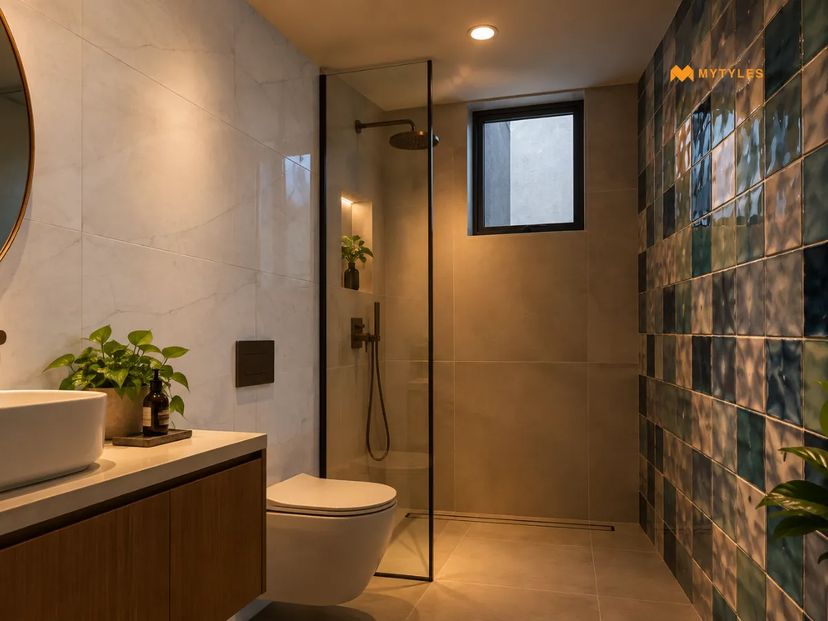
Tile patterns do not always look equally noticeable across a poorly lit room. Marble-look veining, terrazzo speckles, wood-look grains, geometric lines, and decorative motifs can appear more or less noticeable depending on how evenly the surface is lit.
This is worth considering when looking at marble-look light tiles with fine veins or small tonal changes. In a poorly lit part of the room, some of these details may be less noticeable than they were on a well-lit display or product image. Bolder patterns, on the other hand, may remain more visible because there is greater contrast within the design.
For repeating or directional patterns, try to look beyond a single tile as well. Seeing several pieces together gives you a better idea of how the pattern will read across the finished wall or floor.
Consider How Texture Appears Under the Lighting
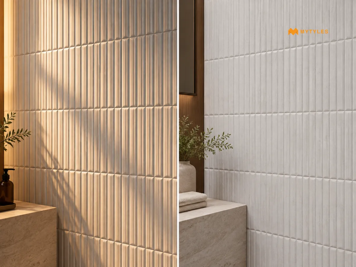
Texture is easier to notice when light creates highlights and shadows across a raised or recessed surface. This matters with textured wall tiles, including fluted, carved, 3D, and other relief designs. With limited daylight, some of these details may not stand out equally across the whole wall.
Artificial light can make a difference here, especially when it reaches the surface from the side or at an angle. With flatter or more even lighting, the same details may appear less pronounced.
If texture is an important part of the design, consider where the artificial lights will sit in relation to the finished wall. This can help you judge whether the surface detail is likely to remain noticeable.
Decide How Noticeable You Want the Grout Joints to Be
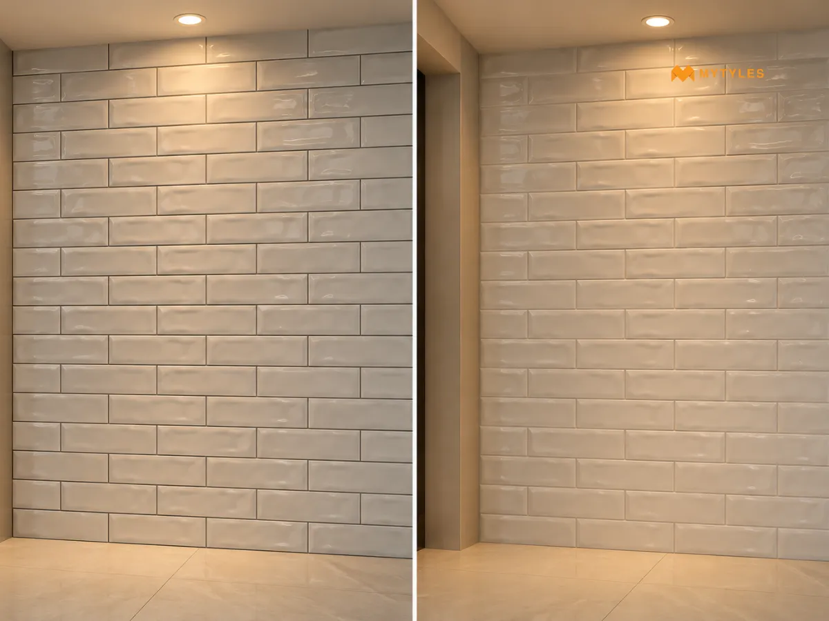
Grout is not only a colour choice. It fills the joints between tiles, so the planned joint width and grout selection form part of the finished tiled surface. The appropriate grout product can also depend on where the tiles are being installed and the conditions they will be exposed to.
Grout colour still matters visually, particularly in a room with limited natural light. Look at the tile and grout together. When there is a stronger colour difference, the joints become more noticeable. For colours that sit closer together, for example, using light grout with tiles of a similar colour can give the space a more continuous look. Check the combination under the artificial lighting used in the room as well.
Consider Tile Size and the Number of Grout Joints
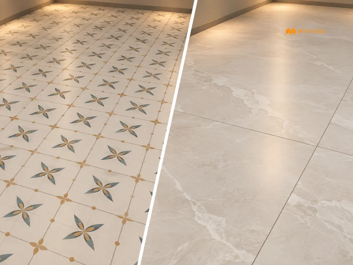
Tile size changes how often the surface is interrupted by grout joints. Smaller formats generally create more joints across the same area, while larger tiles may reduce their number. This can affect how continuous the finished wall or floor appears, including in rooms that receive little daylight.
If you are considering large-format tiles for rooms, look at more than the size of an individual piece. Check how the format fits the actual dimensions of the surface and where cuts are likely to fall. The same applies when planning room floor tiles around corners, doorways, columns, or other fixed elements.
For large-format installations, practical requirements matter as well. Substrate flatness, tile weight, handling, adhesive coverage, joint planning, and the appropriate fixing system should be considered. A larger format should not be selected only because it creates fewer visible grout joints.
Choose Tiles Based on the Light Your Room Actually Has
A room with little daylight does not automatically need white tiles, a glossy finish, or one particular tile size. Look at how the colour, finish, pattern, texture, and grout work with the lighting already present in the space. These visual choices should not override technical suitability, so always check whether the selected tiles for dark rooms are suitable for their intended wall, floor, wet area, or other application.
To get a better idea of what could work for your room, view the tile collection on the MyTyles website or visit the MyTyles experience centre to compare the available colours, finishes, patterns, and formats before making your choice.

Which Tile Colours Work Well in Rooms With Little Natural Light?

There is no single colour that every low-light room needs. Light coloured tiles such as white, cream, beige, ivory, and pale grey are commonly considered, but their appearance can change under different artificial lights. Compare the actual tile with the room's wall colours, furniture, and usual lighting rather than choosing it from the colour name alone.
Do White Tiles Make a Dark Room Look Brighter?
White wall tiles can appear light under suitable lighting, but they do not create additional light in a room. Their appearance still depends on the type, position, and intensity of the available light. Instead of assuming white is necessary for tiles in dark rooms, compare it with cream, ivory, beige, pale grey, and other lighter shades in the actual space.
Should I Choose Glossy or Matt Tiles for a Low-Light Room?
The choice depends on the surface appearance you prefer and where the tile will be installed. Glossy surfaces make reflections more noticeable, while matt tiles have lower surface sheen. Neither finish is automatically the right choice for tiles for low-light rooms. Compare samples under the room's usual lighting and separately check their suitability for the intended application.
How Can I Test a Tile Before Choosing It for a Dark Room?
Take a tile sample into the room and view it at different times with the lights you normally use switched on. Move it between lighter and more shadowed areas as well. This can show how the colour, finish, pattern, and texture respond to the actual lighting and gives more useful information than viewing tiles for poorly lit rooms only in a showroom.
Should Floor and Wall Tiles Be the Same Colour in a Dark Room?
They do not have to match. Wall tiles for dark rooms and floor tiles can use the same shade, related tones, or different colours depending on the planned interior. Look at them together under the room's usual lighting before deciding. A combination that appears similar under showroom lighting may look noticeably different once placed in your room.
Are Plain Tiles Better Than Patterned Tiles for Rooms With No Natural Light?
Not necessarily. Both plain and patterned tiles for rooms with no natural light can be considered. What matters visually is how clearly the pattern appears under the available artificial lighting. Fine veins, grains, or small tonal changes may be less noticeable in some areas, while stronger contrasts can remain more visible. Viewing several tiles together can help when comparing patterned options.
What Should I Check Before Buying Tiles for a Dark Room?
Before buying tiles for dark rooms, compare the colour, undertone, finish, pattern, texture, grout, and tile format under lighting similar to what the room normally uses. Also consider nearby surfaces such as furniture, cabinets, doors, and wall paint. Finally, confirm that the selected product is suitable for its intended wall, floor, wet area, or other application.

ABOUT THE AUTHOR
Nandana Priya
With a strong interest in design, creativity, and emerging tile trends, I enjoy turning ideas from the world of tiles and interiors into engaging, meaningful reads. My writing focuses on creating well-researched content that helps readers understand design choices with more clarity and confidence. I bring together research, design awareness, and digital marketing insights to craft content that is relevant, easy to follow, and thoughtfully written for todays homeowners and design-conscious readers.
Latest Blogs By MyTyles